You’re spending ₹2–5 lakhs a month on Meta and Google. Traffic is coming in. But conversion rate sits stubbornly at 0.8–1.2%. Every optimisation to the ads yields marginal gains.
Here’s the truth most performance agencies won’t tell you: when traffic doesn’t convert, the store is usually the culprit — not the ads.
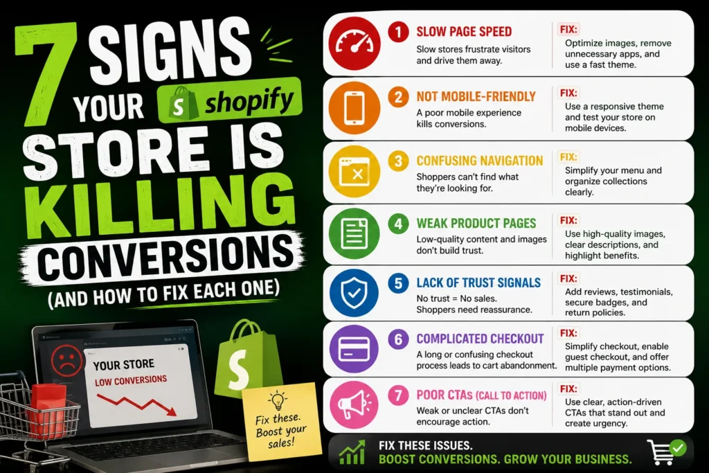
Here are 7 signs your store is silently killing conversions — and exactly how a specialist Shopify development company fixes each one.
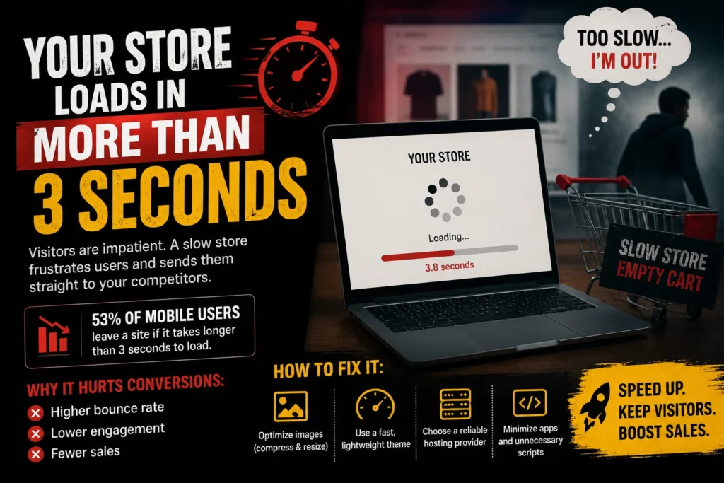
Speed is conversion. Google’s own data shows that a 1-second delay in mobile load time reduces conversions by up to 20%. On Shopify, bloated themes, unoptimised images, excessive apps, and unminified code are the most common culprits.
The fix:
A technical audit of your theme, image compression to WebP format, lazy loading, removal of unused app scripts, and a CDN setup. A Shopify-specialist developer will reduce your Time to First Byte (TTFB) and Largest Contentful Paint (LCP) — the metrics Google and buyers both care about.
Most Shopify product pages are built around what the brand wants to say — not what the buyer needs to know. Generic descriptions, no size guides, no ingredient or material breakdowns, no comparison with alternatives. Buyers who can’t find the answer to their question don’t call you. They leave.
The fix:
A structured product page layout that leads with the primary benefit, covers all objections, includes a detailed FAQ section, displays real customer reviews with photos, and ends with a strong, specific CTA. A Shopify development company builds this as a conversion-optimised template applied across your catalogue.
Over 80% of eCommerce traffic in India comes from mobile devices. Yet most Shopify themes are designed desktop-first and poorly adapted for mobile. Tiny buttons, text that overflows, images that don’t scale, and checkout flows that require excessive scrolling all destroy mobile conversion rate.
The fix:
Mobile-first design — not responsive design applied after the fact. Every element of the store is built for a 375–390px screen first, then expanded to desktop. Thumb-friendly button sizes, sticky Add to Cart bars, and single-column checkout layouts are non-negotiable.
Every extra step in the checkout process is a dropout point. Mandatory account creation, multi-page forms, limited payment options, and the absence of COD (in India, still critical) all increase cart abandonment.
The fix:
Enable Shopify’s accelerated checkout (Shop Pay, Google Pay, PhonePe), make guest checkout the default, display all payment methods prominently on the cart page, and implement a one-page checkout layout where possible. These changes alone can lift checkout completion rate by 15–25%.
Indian online shoppers are cautious — and rightfully so. Before they buy, they want to know: Is this brand real? Will delivery actually happen? What if I need to return it?
The fix:
Trust badges (payment security, return policy, genuine reviews), delivery timeline displayed on the product page, founder story or “About Us” snippet, media mentions, and a visible customer support option (WhatsApp chat preferred in India). These elements should appear above the fold — not buried in the footer.
If a buyer can’t find what they’re looking for in under 3 clicks, they leave. Overcrowded menus, vague category names, no search functionality, and poor collection page structure all create friction.
The fix:
Simplified navigation with clearly named top-level categories, a prominent search bar with autocomplete, filtered collection pages (by price, type, size, use case), and breadcrumb navigation. A well-structured Shopify store guides the buyer from landing to checkout without resistance.
“10% off on first order” used to work. In 2025, it barely gets noticed. If your offer doesn’t communicate immediate, tangible value — and communicate it within 5 seconds of landing — buyers scroll past.
The fix:
Test bundle offers (“Buy 2, Get 1 Free”), threshold-based free shipping (“Free delivery above ₹499”), gift-with-purchase mechanics, and limited-time urgency triggers. A Shopify development company builds these offer mechanics directly into the product page and cart — not just in a popup that gets dismissed.
You’re early stage, SKU count is under 50, and you need a fast, cost-effective launch.
Invest in custom development if:
You have complex filtering needs, a large catalogue, subscription products, B2B + D2C hybrid selling, or if your conversion rate is persistently below 1.5% despite good traffic.
Increasing ad spend on a store with conversion leaks is like filling a bucket with a hole in the bottom. More water, same result.
The most profitable intervention you can make as a D2C brand right now is to audit your Shopify store for every conversion killer listed above — and fix them before your next scaling push.
Ready to turn your Shopify store into a conversion machine? Work With Aim n Launch — India’s Specialist Shopify Development Company